_

Gileo Van Zach

We’re so thrilled to work with Gileo Van Zach—a fine jewellery brand in Cape Town where workmanship really does still feel personal.

They create pieces that don’t need to overcompensate, because they are inherently beautiful. You can see the attention to detail in the weight of a ring, the texture of a pendant. It’s the type of thing you notice when someone truly cares about what they do.

You can find their pieces in luxury department stores around the world, but they’ve also got a healthy online presence. Their e-commerce store enables someone from Joburg, London, or really anywhere, to be able to browse and buy without setting foot in a showroom.

But as the brand was growing, the online side needed to level up. It wasn’t just about having a “nice looking” website either, they were after a space that would be an extension of their identity.

Minimal lines. A subtle kind of elegance. Something that invites you to pause for a second and imagine how the piece will look on your own hand. A space for people to explore, customise, and fall in love with their next heirloom.

That’s what we created: an online experience that doesn’t attempt to outshine the jewellery, but somehow make each piece even more special.

Lead Time: 6 Months

Sector: eCommerce (Luxury Jewelry)
Target Type: B2C (Business to Consumer)
Demographic: Affluent women and men aged 30-55, predominantly professionals and high-net-worth individuals seeking premium, high-end jewelry. The focus is on urban areas in South Africa and international clients with an interest in luxury accessories.
Website Goal: Elevate online sales, enhance mobile accessibility, improve SEO visibility, and boost brand recognition within the luxury jewelry market.
Services: eCommerce SEO, Shopify SEO, UX & Conversion Rate Optimisation, Branding, SEO Optimization, SEO Audit 

Gileo Van Zach Case-Study Header Image

32%

Surge in Online Sales

_

The Challenge

Amazing jewellery. A stellar reputation. A worldwide following. The catch? They were stumped when it came to their digital footprint.

The brand had outgrown the website… and the website had… pretty much not evolved at all.

It didn’t suit the jewellery. The look and feel just felt dated, a bit past its prime, and unexciting around the edges.

The design lacked the warmth and lustre of the pieces themselves. Navigation was awkward — a series of clicks that left you unsure if you were losing it or the site.

Customers found browsing difficult, let alone purchasing.

The audience had changed but the site hadn’t. Their clientele had evolved, growing older, and more discerning.

But the website still spoke to a younger demographic. It lacked the comfort, clarity, and quality that the brand’s buyers had come to expect naturally.

Mobile… let’s not even go there. On a smartphone, everything was squished or half broken.

Buttons didn’t quite line up, images were awkwardly cropped, and most customers probably left before they even got a good sense of the brand.

SEO… yikes. They were invisible where it counted. The site lacked the structure, content, and signals to rank on search results pages, narrowing the funnel before anyone had the chance to visit at all.

They needed an online presence that mirrored the brand that Gileo Van Zach had become: elegant, reliable, and above all else: a customer-activated experience.

Gileo Van Zach Case Study
_

Outdated eCommerce Infrastructure

Gileo Van Zach’s digital journey with us started with a discovery of their existing tech stack.

As they described to us how they felt their site had let them down, it became painfully obvious that their eCommerce infrastructure had taken a toll on their brand.

Outdated. The site was visually tired, leaving an awkward first impression on customers. But when selling luxury, the initial experience is a differentiator that no one really wants to compromise.

Off brand. It just didn’t fit. The overall digital experience was significantly out of sync with the tastes and expectations of their discerning, grown-up audience. And it wasn’t just the look and feel of it.

The entire technical setup didn’t support them. Slow load times. Unclear navigation. An out-of-date platform that limited growth and made their internal operations unnecessarily cumbersome.

The rest of the online world had advanced. Gileo Van Zach was getting left behind.

So, we jumped in.

We re-platformed their entire store on Shopify. A clean, modern, flexible base that gave the brand the room to breathe it needed. The change was more than just a facelift.

The Shopify upgrade didn’t just make the site lightning fast (though that was a relief in and of itself); it opened up the door for improved integrations, a mobile-first design, and a backend that their team could manage easily.

It was the difference between a renovation and a complete gut and rebuild of the interior. A stable, secure, flexible foundation to grow and change as the brand needed.

From the second a customer lands on the Gileo Van Zach site, their new experience is the Gileo Van Zach experience: luxurious, effortless, quietly confident.

_

Disconnected Brand

In the pre-rebrand, Gileo Van Zach’s website experience was not embodying the luxury experience they were hoping for. It was as if the customer was listening for that experience down the hallway, on the other side of the door.

The site design was dated, the user experience was “functional in that you will eventually get it” nature and it was nothing like the detail they go into for their jewellery.

Customers can and did feel that. The way they hesitated as they shopped told the whole story. That one-two microsecond where they realize, “This place just doesn’t seem as premium as I thought it would be”. That’s the point, where potential customers get lost.

We wanted to work with a design agency that understood this and appreciated aesthetics. The design work had to have the kind of ‘gravitas’ that lives up to the brand.

The new site had clean design lines, uncluttered layout, intuitive navigation (but not in a boring way) and an overall shopping experience that reads as refined but not obnoxiously so.

And the design elements were only half of the equation. Backstage, we were working to repair some of those things that most people don’t think about. SEO base setup, structure organization and real user analysis.

Detailing as simple as adding alt tags to images (for accessibility and Google’s comprehension) are some of the behind-the-scenes adjustments that can make a world of difference.

We rethought the layout, cleaned up the “jagged edges” and simplified some of the moments that pulled customers out of the experience.

Photos were crisp and considered, the design elements felt more purposeful and less decorative. Slowly but surely, the site began to take on a quietly confident air of exclusivity.

But the best part is, it finally feels like Gileo Van Zach. And the numbers are proving it, but even if they weren’t, you would just know.

Case Study Mobile Accessibility Improvements
_

Mobile Accessibility

More and more customers were shopping with their phones, which of course we all do, now so mindlessly habitual that it barely registers.

But browsing their site with a phone in hand was painful, like it had been heaved onto mobile begrudgingly and begrudgingly only. Buttons were pinched, pages lurched, and the whole experience felt like one you’d give up halfway through.

The solution seemed almost self-evident.

The design was reconstructed to flow organically no matter what device you were using – phone, tablet, some in-between hybrid.

Navigation was simpler, load times shorter, and images no longer lost resolution when you so much as tilted your device. Interactions were universally touch-optimized, like one of those things you only notice when it’s poorly done.

Product galleries, the cart, checkout flows and everything in between was redesigned with mobile-first behaviour as the North Star. And once that was done, the experience just…clicked. Shopping with their phones was just easy.

The results are self-evident, too. Mobile sales have increased.

_

Improve SEO Performance

Before our involvement, the brand was essentially invisible in search. The site wasn’t “broken”, it just hadn’t been built with SEO in mind.

It didn’t have a real shot at ranking where the brand’s customers were looking.

We began with an SEO health audit. Mundane work, not glamorous, but essential.

From there, we focused on the areas that actually make a difference: technical cleanups, speed improvements, focused content, and natural (instead of contrived) keywords.

In the process, we also ensured the content had some actual verve to it: written first and foremost for actual human beings (with the clarity that search engines inevitably reward anyway).

It’s an imbalance all too many sites fall into.

The site started to move. Gradually at first, and then more perceptibly. Traffic increased.

The brand began to show up for more people organically, without the burden of paid search cranking at all times.

And it was then that organic traffic became relevant again.

Case-Study-Improved SEO Performance
_

The Results

In the end, when all the pieces finally fell into place for Gileo Van Zach, it was almost an intangible thing.


It wasn’t something you could quite see. But you could definitely feel it in the stats.

  • Sales increased by nearly 32%. Not really a surprise in hindsight when the site was humming along nicely. More traffic in, more traffic retained, and well… they shopped. And when the numbers back it up, it’s always a good feeling.
  • Organic traffic was up as well. Traffic increased by approximately 65%. Apparently, the SEO efforts actually paid off and were able to increase brand visibility to those who were already actively searching for such a product or service.
  • Conversions saw a modest increase too, by about 28%. Visitors stayed, navigated through fewer pages, and simply didn’t act as web tourists anymore. No more browsing, they were shopping.
  • Users weren’t bouncing either. Time on site increased by 35%. In fact, people stayed, they clicked through a few more pages, they took their time to get acquainted with the brand. The best customer behaviour you could hope for.
  • Traffic from mobile devices took off too - Once that experience was no longer arduous, the use of a phone to actually shop turned into a cakewalk — and clearly where a significant segment of customers live these days.

SEO continued to work overtime in the background too. Attracting higher-quality, more qualified traffic with the right keywords, along with some much-needed technical SEO cleanup, allowed the site to slowly but surely start to rise in SERPs.

Technical Tools:

Screaming Frog SEO Spider, Yoast SEO, Ahrefs Site Audit, Google Search Console, TinyPNG, SEOPress, Semrush Site Audit, TinyIMG, Google PageSpeed Insights, Figma, Contentsquare, Hotjar, Responsinator, BrowserStack
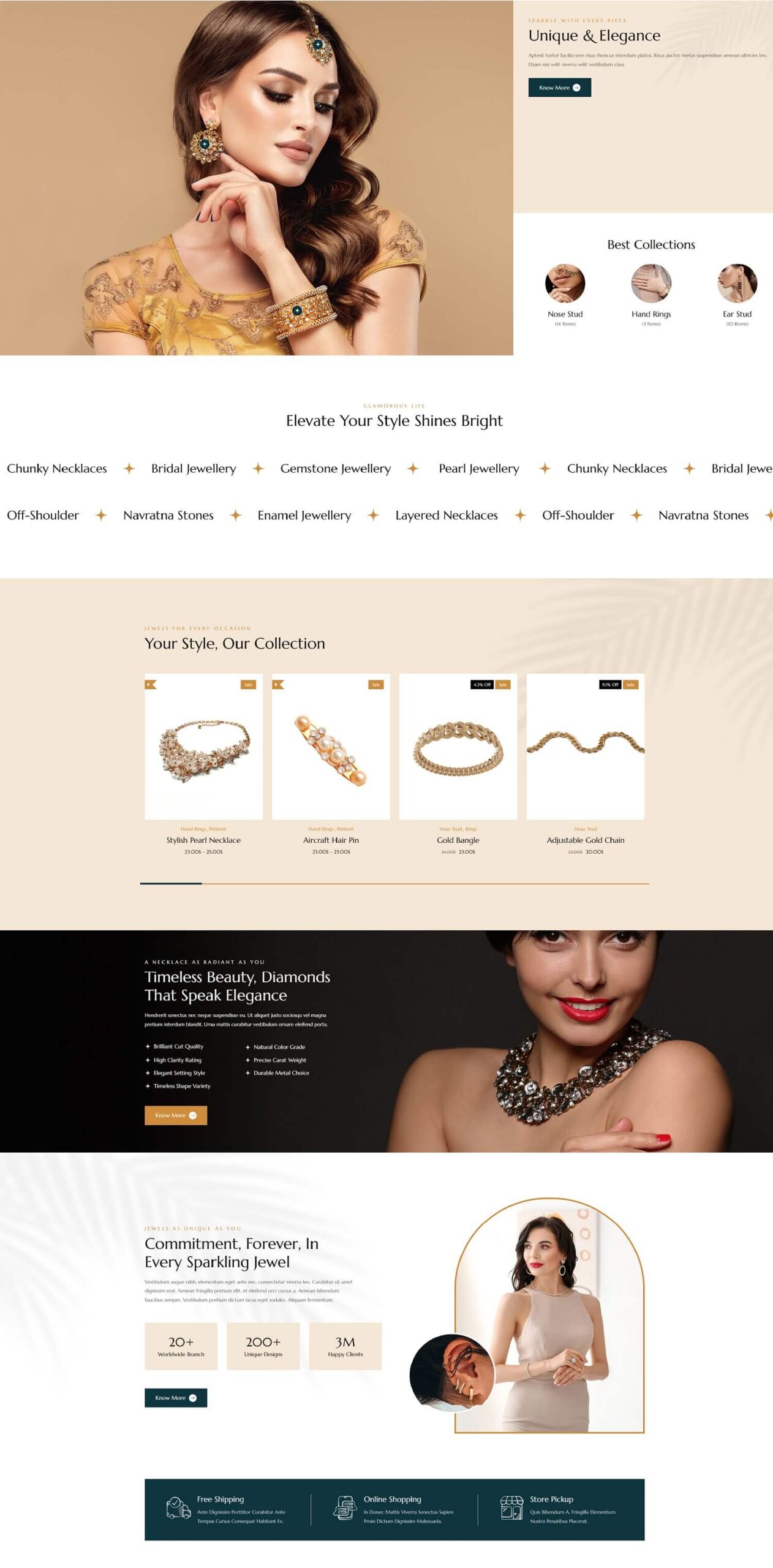
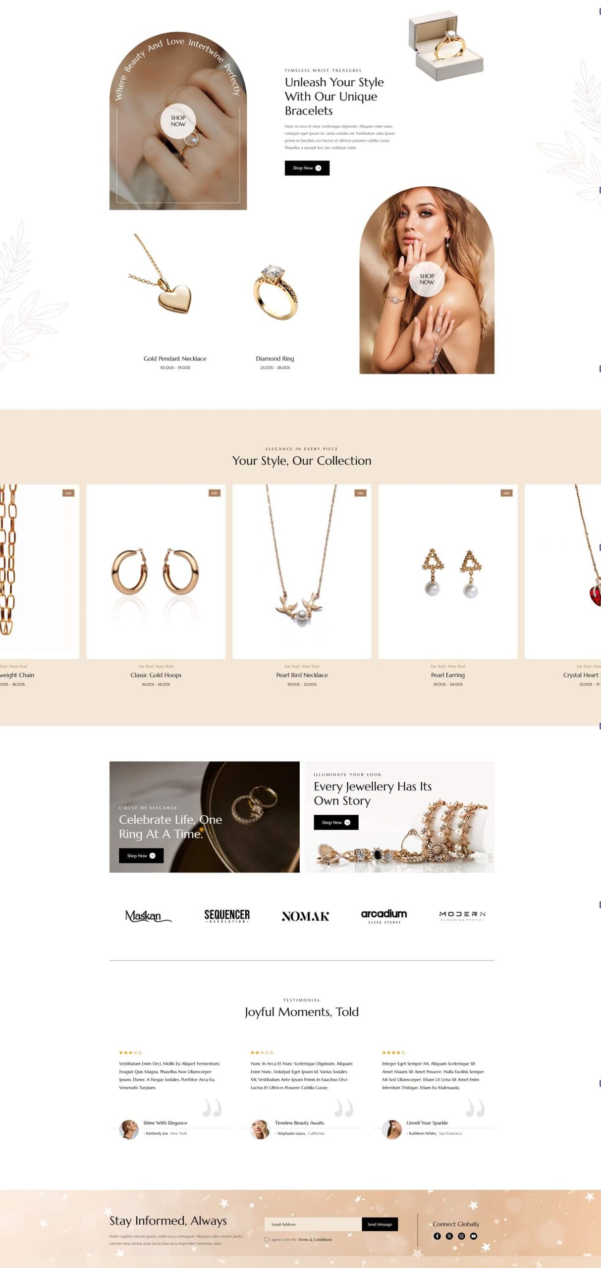
SEO Services

eCommerce SEO, Shopify SEO, UX & Conversion Rate Optimisation, Branding, SEO Optimization, SEO Audit

What Our Clients Say

Here’s why clients enjoy partnering with us

EcoSEO transformed our online presence! The new website truly represents the luxury and elegance we want our brand to convey. Our customer engagement has skyrocketed, and sales have followed suit. The team's attention to detail and dedication to understanding our vision was exceptional.""
Gileo-van-zach profile image Testimonial
Gileo Van Zach Team